If you have been reading the the CSS 2.1 Specifications you may have come upon a couple of interesting terms: replaced and non-replaced elements. Let’s delve a bit deeper into what replaced elements are, which elements they include, and some examples of each.
Definition of a Replaced Element
I stumbled upon them while researching the width and height attributes of elements with different positions, and was confused about their meaning. Luckily, the specs provide a definition:
An element whose content is outside the scope of the CSS formatting model, such as an image, embedded document, or applet. For example, the content of the HTML IMG element is often replaced by the image that its “src” attribute designates. Replaced elements often have intrinsic dimensions: an intrinsic width, an intrinsic height, and an intrinsic ratio. For example, a bitmap image has an intrinsic width and an intrinsic height specified in absolute units (from which the intrinsic ratio can obviously be determined). On the other hand, other documents may not have any intrinsic dimensions (for example, a blank HTML document).
Basically, if the content, and let me repeat that, the content cannot be styled by the css on your document then it is a replaced element. Why is the content outside the scope of the css? Because the content is brought in from outside the document, or, in other words, the content is replaced.
Which Elements are Replaced Elements (Embedded Content)
Which elements import their content from somewhere else? Those are called embedded content. The HTML 5 Specification on embedded content gives us a definition and list:
Embedded content is content that imports another resource into the document, or content from another vocabulary that is inserted into the document.
audio, canvas, embed, iframe, img, math, object, svg, video
List of Embedded Content (Replaced Elements)
- audio
- canvas
- embed
- iframe
- img
- math
- object
- svg
- video
False Objections
Someone may object and say, “well I can control the size of an image or iframe using css, so how come those elements are still considered replaced elements?” The answer to that is simple. The element itself can be styled using css, but the content can’t.
Notice the emphasis on content. Let’s dig deeper regarding the meaning of content.
What is Content?
The CSS 2.1 spec has a definition for content:
The content associated with an element in the source document. Some elements have no content, in which case they are called empty. The content of an element may include text, and it may include a number of sub-elements, in which case the element is called the parent of those sub-elements.
So, basically, anything that goes in between the opening tag and the end tag of the elment is the content. What are the things that can go in between the opening and end tags?
- Text
- Other elements
Therefore, an element is a replaced element if the CSS does not affect the text or other elements that are between the opening and closing tags.
The content is one part of the whole element. The content is not the whole element. There is more to the element than the content. Hence, there are CSS styles that may apply to different aspects of an element.
Understanding where the Content is in Relation to the Box Model
For this we need to understand the box model. Check out the box-model diagram in the CSS 2.1 spec.
Starting from the outside going in you can see the following:
- Margin Edge
- Margin
- Border Edge
- Border
- Padding Edge
- Padding
- Content Edge
- Content
Content is the innermost part, and remember that the content is actually text and other elements inside the element.
It’s obvious that the margin, border and padding CSS properties are outside the content. However, the objection raised above was regarding width and height CSS properties which seem to be related to the content. Let’s go deeper into those properties.
Don’t Width and Height Affect the Content?
Once again the CSS 2.1 Spec on content-width and content-height comes to the rescue:
The dimensions of the content area of a box — the content width and content height — depend on several factors: whether the element generating the box has the ‘width’ or ‘height’ property set, whether the box contains text or other boxes, whether the box is a table, etc. Box widths and heights are discussed in the chapter on visual formatting model details.
It is important to notice that height and width indicate the, “content area of a box”, i.e. not the actual content. Therefore the width and height property still apply to the element itself and not the contents directly.
It’s like controlling the width and height of your browser.
Besides that, width and height are not inherited properties and so the value of those properties should never be applied to the contents.
Examples of Replaced Elements
Let’s take a look at some examples.
Let’s make a CSS class to apply to all these elements that we will test:
.test
{
    margin: 10px;
    border: 10px solid green;
    padding: 10px;
    width: 200px;
    height: 100px;
    background-color: blue;
    color: red;
    font-size: 20px;
}
Notice that I have chosen properties that correspond to the layers of the box-model discussed above, starting from the outermost layer, the margin, then the border, then the padding then the content area (height, width, background) then the contents (color, font-size).
img
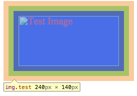
Let’s make an image with no actual source, so it can show the alternate text.
<img src="non-existant.jpg" alt="Test Image" class="test" />
The following is what we get:
I have the chrome inspector on to show you the different layers of the box. We see the words, “Test Image” inside the content area. The words are red and have a font-size of 20px. That would seem to contradict that the img element is a replaced element. In fact, in this case nothing was imported from an external source and so nothing was replaced.
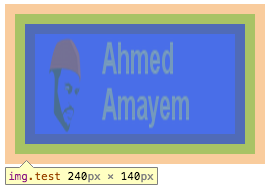
Let’s try again with an actual image.
<img src="existant.png" alt="Actual Image" class="test" />
The following is the result:
Notice that the dimensions are affected but the text in the image sure isn’t. The blue background belongs to the img element and only shows because the image has a transparent background.
iframe
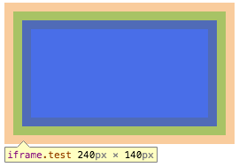
The img element is a bit trivial because it is a self-closing element, i.e. it can’t have children. The iframe element gives us something more to play with because it is not self-closing. Let’s try it out without a src and some children and see what happens:
<iframe class="test">
    <html>
    <head>
    </head>
    <body>
        <p>Hello World!</p>
    </body>
    </html>
</iframe>
The result is as follows:
Looks like we got nothing for the content. That is to be expected because iframes only embed content from a src or srcdoc and don’t actually render the children.
Let’s try again with a proper source. Let’s make another html doc in the same resource folder and use it in the above code and put it as a src.
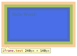
<iframe class="test" src="embeddedDoc.html"></iframe>
The result is as follows:
As you can see the words, “Hello World!” are black and are not 20px large as dictated by the class, “test”. Let’s compare this to having a div with those words inside:
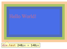
<div class="test">
    <p>Hello World!</p>
</div>
The result is as follows:
Clearly the contents of the div have been affected.
Non-Replaced Elements
I couldn’t find the definition of non-replaced elements in the CSS 2.1 spec, but that is expected since they already gave us the definition of replaced elements. Just add a negation to the beginning of the replaced elements defintion and you get the definition for non-replaced elements.
These include all the non-embedded elements. So it includes all the elements minus the list of the embedded elements above.
Non-replaced elements are pretty straightforward. Their contents are affected by the CSS in the document. That means that if a property can be inherited then the contents will inherit those properties from the parent, and any CSS that can apply to them directly will apply to them as was seen in the last example.
